Making Word Documents Accessible & Effective

Photo Caption Here
Check the items below to ensure that your Word documents are accessible and usable by all students on different platforms.
Tip for Mac Users
Choose Ribbon from the View menu - this will provide an interface similar to those shown in the instructions below.
-
Use Properly Formatted Headings to Structure Documents
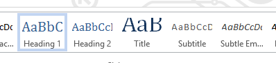
Use the style options in the ribbon to designate headings Properly structuring a page with headings provides important navigation cues to blind users who use screenreaders (devices which read screen content verbally) and provides a structure to format pages properly on different devices and window sizes.
- Select the text to mark as a heading
- Select the home tab from the Word menu
- In the styles gallery, choose the appropriate heading level (see the next section on the proper way to order headings.
- Warning: the default style in Word sets headings to colors with insufficient color contrast. See the instructions below on how to override these default colors.
Other Benefits:
Word creates an interactive outline from the heading structure of your document in the Navigation pane as seen in the following figure.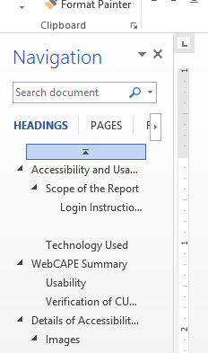
Make learning objectives, expectations, assignments and due dates, grading rubrics, assessment questions, and other course elements clear and direct.
- Create Clear and Consistent Navigation
Whether creating navigation menus for a course website, or a module table of contents within D2L, use concise and user-friendly language. Place navigation consistently across your site. This will allow students, including those using screenreaders and other assistive technology, to more quickly find information within your course.
Learn more:
Document Structure and Formatting
- Use Properly Formatted Headings to Structure Documents and Web Pages
Designate headings (through styles in Word or markup in HTML or formatting tools in D2L) instead of relying on visual cues only, such as: large font size, color, boldness, etc. Properly structuring a page with headings provides important navigation cues to blind users who use screenreaders (devices which read screen content verbally) and provides a structure to format pages properly on different devices and window sizes.

Heading designated through styles 
Bold format used to make normal text appear as heading Learn more:
- Create True Bulleted or Numbered Lists, True Columns and Tables
Use the formatting features of Word or D2L or HTML markup to create lists, columns and tables instead of using spacebar or tab to emulate structure. Similar to headings, properly formatting lists, columns and tables provide additional information and orientation to the screenreader user. Editing and adding to lists and tables is also much easier when they have been formatted properly.
- Use Column Headers for Tables in Word and Column and/or Row Headers for Tables in Web Documents
Screenreaders read the column headers in Word tables as the user moves across a row, providing orientation and context for the data in the cell. Column headings also provide orientation for the visual user by repeating column headers on each page.

This header row will repeat at the top of each page In HTML documents you can designate both column and/or row headings. This process is more complex. See “Learn more” below for further guidance.
Learn more:
- Use Descriptive Hyperlink Text
Use hyperlink text that makes sense on its own and describes the resource or destination of the hyperlink; for example: “read more about course requirements” or “Chicago Style Manual Online.”
Vague hyperlinks such as “click here” or “more” do not provide clear information for screenreader and screen enlargement users who may listen to or view hyperlinks out of context. Providing the full URL is also not recommended since the format is difficult to read and may not provide descriptive information.

This link, styled as a button, provides enough information to be understood out of context - Avoid Capitalizing All Letters (i.e. “All Caps”)
Capital letters are harder to distinguish than lower case letters and thus inhibit reading. Therefore only use “All Caps” for acronyms or abbreviations.
Learn more:
- Break-up long blocks of text into smaller segments
If we create documents which structure pages with clearly marked headings and sub-heading we enhance the ability of students to scan and find information.
Consider presenting information more as an annotated outline, where the information is focused specifically towards the learning outcome(s) for the module.
Images
- Provide Alternative Text for Images
For every non-text element such as images, charts or graphs, provide a concise (100 characters or less) description of the information conveyed by the image.
Learn more:
- Instructions for entering ALT text in Word
- Entering ALT text in Powerpoint
- HTML ALT attribute
- Guidance on creating effective ALT text (off-site link)
Keyboard Access
- Confirm that all actions and controls accessible with a mouse (e.g. form fields, submit button, hyperlinks) are also keyboard accessible
Blind users and many individuals with mobility disabilities use the keyboard to navigate through online content. Use the guideline under “Learn more” for instructions on testing your site for keyboard-only users.
Learn more:
Color and Contrast
- Provide sufficient Color Contrast between foreground and background elements
In addition, ensure that background design does not overwhelm or diminish legibility of foreground text (e.g. PowerPoint, Web page, etc.)

This busy background design undermines readability of the foreground text The international standard for color contrast for standard size text is 4.5:1; for large size text (at least 18 pt. or 14 pt. bold), the requirement is 3:1. See resources below for tools to measure contrast ratio.
Learn more:
- Do Not Convey Information Using Color Alone
Conveying information by color is an effective means for conveying information for many uses. However, also provide a means aside from color (e.g. “form fields highlighted in yellow or preceded by an asterisk indicates a required field”) for individuals who are blind or color blind.
Multimedia
- Provide transcripts for audio-only media
- Caption Videos
Transcripts and captioning not only assist individuals who are deaf or have hearing impairments but also individuals who speak English as a second-language. Studies have shown that captioning increases user engagement for viewers overall. For videos in the public domain (e.g. YouTube), captions increase search engine findability.
Learn more:
- Who is responsible for captioning?
- Captioning your own videos
- Captioning & transcription resources at Continuing Ed.
- Other benefits of captioning
- Going further – audio description of visual content
PDFs
- Avoid Image-only PDFs
Image only PDF - highlight falls unevenly around text and not across whole line If you cannot highlight text in a PDF, then the PDF is image-only and impossible for screenreaders or other tools that read PDFs verbally to access. Image-only PDFs are also generally more difficult to read for everyone due to poor resolution and lose fidelity when enlarged.
If the document is an article from a 3rd-party source you may be able to obtain an accessible copy of the material from an online journal database. Otherwise, use the “recognize text” option in Adobe Acrobat Pro (this option is not available in Adobe Reader) to convert the document to computer-readable text. Then follow the steps outlined in the next item to check and remediate any other accessibility issues.
- Run the PDF Accessibility Check to Ensure Full Accessibility
Once determining that the text in your PDF is readable, follow the repair recommendations provided by the built-in Accessibility Checker in Acrobat Pro (this option is not available in Adobe Reader) to fix errors.
Learn more:
- Watch the tutorial on checking and repairing PDF files for accessibility
- Creating Accessible PDFs form Word Documents
PowerPoints
- Ensure that all of the slide text content appears in the outline view
Students with visual disabilities may prefer not to access the more visual slide view. See the tutorial below for how to review text in outline view.
- Format Lists and Tables Properly; Add ALT Text to Images
As mentioned above for documents in general, use the formatting features of PowerPoint to create true lists and tables. See “Learn more” below for step-by-step instruction.
Learn more:
Math and Science
- Write math and science equations accessibly
Create math and science equations with MathML (D2L equation editor), LaTeX, or MathType.
Learn more: