PowerPoint Accessibility & Best Practices
Follow the guidelines below to ensure that your PowerPoints are accessible and usable by all students.
Tip for Mac Users
Choose Ribbon from the View menu - this will provide an interface similar to those shown in the instructions below.
Office 2010 - 2013
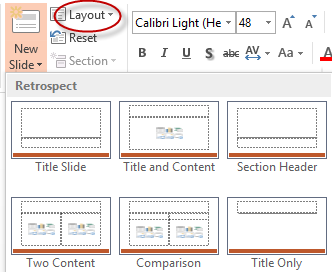
- Use the Templates provided under the Slides area of the Ribbon
- Select the home tab from the PowerPoint menu
- Select the new slide icon to choose from available slide types
- To change a selected slide type, use Layout
- Provide Alternate Text for Images
- Right click on the image or use cntr + mouse click if are using a one-button mouse on a Mac.
- Select Format Picture and the Layout & Properties option.
- Enter the alternative text into the description area and not the title field.
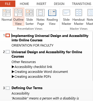
- Ensure that your Slides are Readable in Outline View
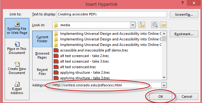
- Use Descriptive Hyperlink Text
- Highlight the text that describes the destination of the link.
- Select Insert> Hyperlink.
- Enter the url into the Address field and select OK.
- If you think students will be printing the page and will need the full url, provide it in parenthesis after the link but don't make the hyperlink active.
Example: CU-Boulder (www.colorado.edu)
- Vague hyperlinks such as “click here” or “more” do not provide clear information for screenreader and screen enlargement users who may listen to or view hyperlinks out of context.
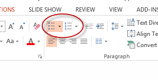
- Format Lists as Lists
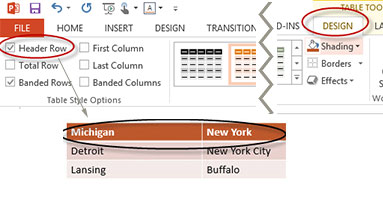
- Use Headers for Data Tables
- Place your cursor anywhere in the table.
- Select the Design tab.
- Select the Header Row checkbox.
- Select First Column if your first column is also a header (2nd example)
- Provide sufficient Color Contrast between foreground and background elements
- Do Not Convey Information by Color Alone
Using the default layouts will ensure that your slides are structured with proper headings and lists and read in logical order.
Step-by-step Instructions
For every informative image (an image that conveys concepts or information), provide a concise (100 characters or less) description of the information conveyed.
Step-by-step Instructions
.png)
Decorative Images
If images are simply decorative and convey no useful information, leave the Description blank so that it will be ignored by screenreaders.
Check your slides in Outline View to ensure that all your text is displayed and presented in the correct order. Some students, including blind, low vision, and students with reading disabilities may prefer to read content in outline view.
Select View> Outline View
Instead of pasting a full (and hard to read) url into a slide, use insert hyperlink to create link text which is descriptive and describes the link destination.
Step-by-step Instructions
Hyperlink Tips
By default, PowerPoint places your text content into an outline format, usually using a bullet point style. (Outline View - item 3 above - shows this structure explicitly). Using this format helps both screenreader users and provides visual organization for other students.
Use bullet-points for most lists and numbered lists when presenting sequential instructions or to provide an index or tally of items in your list.
Screenreaders read the column and row headers in PowerPoint tables as the user moves across a row or down a column, respectively, providing orientation and context for the data in the cell. Headings also provide orientation for the visual user by highlighting or bolding the heading row and/or column.
Step-by-step Instructions

In addition, ensure that the background design does not overwhelm or diminish legibility of foreground text (e.g. PowerPoint, Web page, etc.)

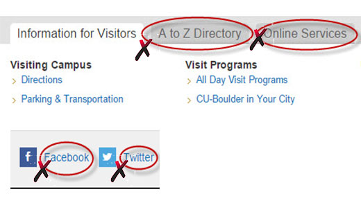
The snippet below from the CU-Boulder home page shows some examples of poor color contrast. Dark gray on light gray is a common color combination that usually does not produce sufficient color contrast. Note that the uncircled text meets contrast standards.
Learn more:
If conveying information by color also provide a means aside from color for individuals who are blind or color blind and to provide multiple cues to all users.